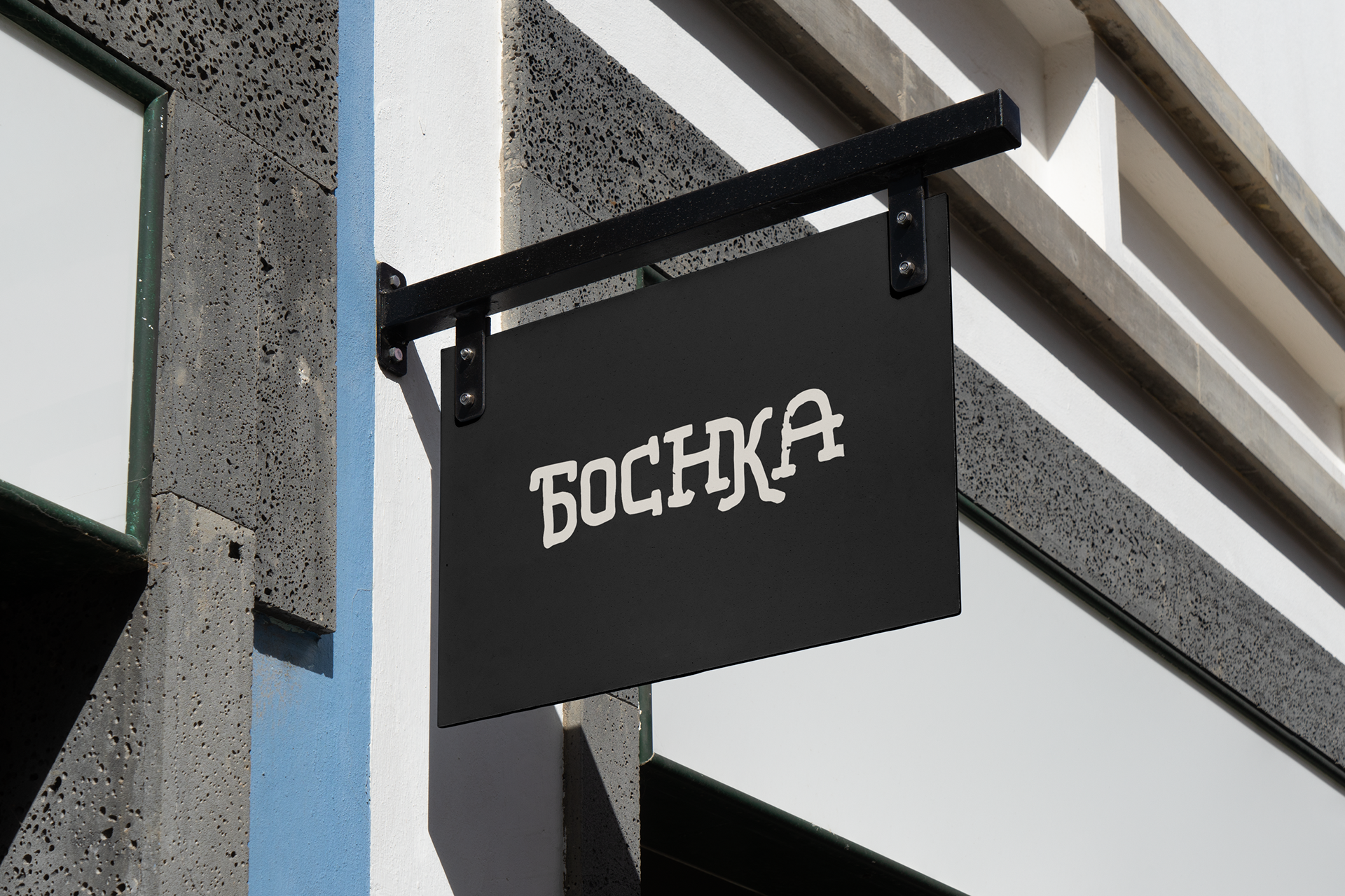
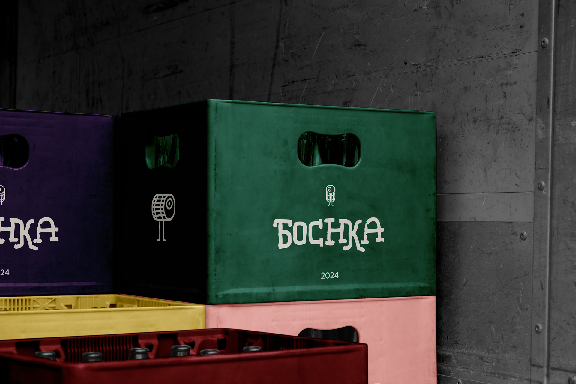
Branding project for Bochka.
Bochka means barrel.
My client wanted to go for a funky look & feel for his unique beers and spirits shop and also wanted to keep the Cyrillic "Б" somehow in the logo.
The challenging part was to keep the vibes fresh, make the Cyrillic "Б" understandable for people who are not familiar with Cyrillic script.
Visit this wee shop for an exciting selection of beers and many others in Glasgow :)


